Successful infographics keep a balance between visual and textual content
Infographics are effective ways of communicating ideas. But what dictates a good infographic? There is a balance between the visuals and textual content. Submit Infographics, Digital Information World and Top Infographic have good examples of infographics that effectively communicate their content.
Submit Infographics

This infographic represent the global catalyst regeneration market in a simple, easy-to follow infographic. The visual content adds the textual content, rather than act as distracting designs.
Digital Information World
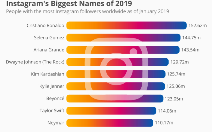
This infographic is cleverly designed to show the Instagram logo without taking away from the information presented.
Top Infographic

Similar to the last two infographics, the visuals used add the understandable of the content presented.
Conclusion
Good infographics keep their designs simple and emphasis the important aspects of their data. Textually and visually the infographics are kept understandable so the audience can process the information better. These blogs show the effectiveness of simple, easy-to-follow infographics.
