Start Using Charts and Diagrams!

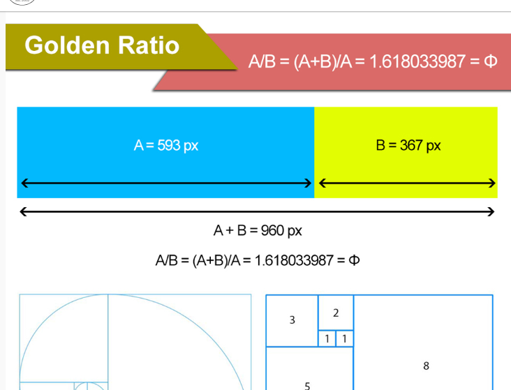
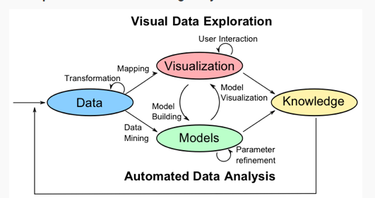
Diagrams are communication devices that can visually illustrate relationships in information

It is difficult to show the relationship of large amounts of information. How can we visually represent large amounts of information so an audience can effective see the relationships? Diagrams and charts effective method to illustrate information that has a relationship. Digital Information World, Flowing Data and TwoSix Labs show examples of effective diagrams and charts.

Digital Information World

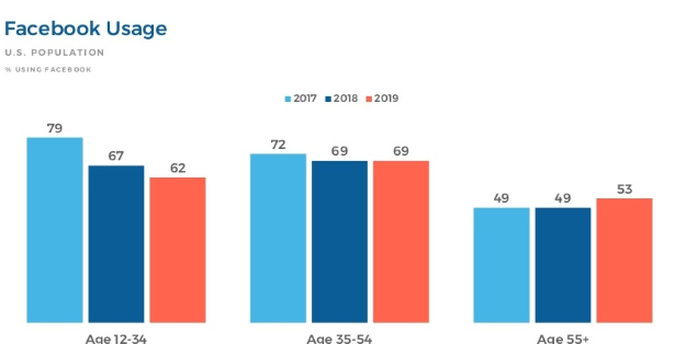
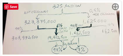
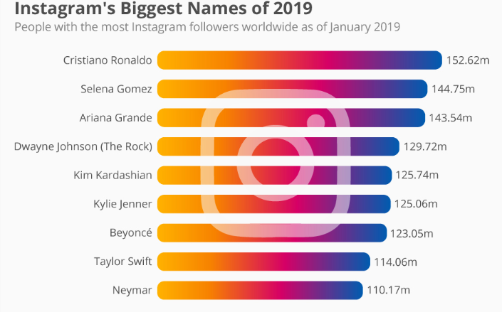
These chart is used to show the Facebook usage in the past three years by ages.
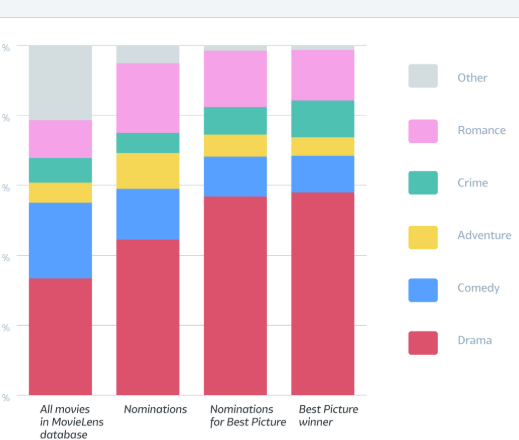
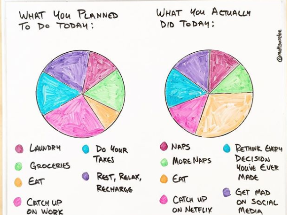
Flowing Data

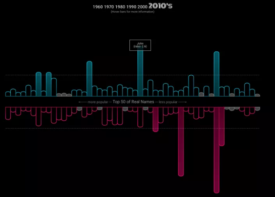
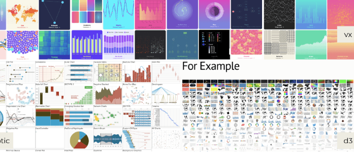
Flowing Data creates a chart that compare the names in moves vs. real life.

TwoSix Labs

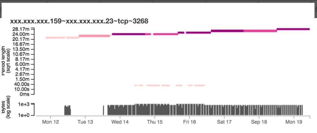
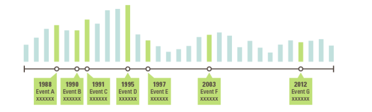
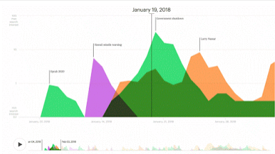
TwoSix Labs show the challenge that network security has in identifying malicious activity among mass amounts of activity.

Conclusion

These blogs show the effective use of charts and diagrams to represent large and continuous amounts of information. Charts and diagrams are effective communication tools and are used regularly to show simple or complex data to an audience.

What to you need to know when Communicating to people

Understandable content comes from good communication

We want people to understand what we are talking about. How can we manage that? Good communication often relies on details like typography and diagrams. These details make the difference from understandably and complicated information. The Functional Art, Usability Geek and Visionoix talk about some factors of good communication.

The Functional Art

The functional Art writes about reasoning with diagrams. Diagrams are used to carefully illustrate a process of understanding.

Usability Geek

Usability Geek looks at the process to achieve good writing.

Visionoix

Visionoix specifically looks at typography and the principles of typography for effective communication.

Conclusion

Good communication considers many factors in order to reach an audience effectively. We pay attention to the details such as typography and diagrams in order to illustrate our content. These blogs are examples of how effective communication relies on the little details in order to reach an audience.

Make Complex Information Simple

By using infographics, you can take the complexity out of complex content.

When we are faced with complex information, we tend to lose focus and not understand the content. But how can we use visual communication to change this fact? Visual communciation comes in many forms, such as infographics, charts, diagrams and many more visual-based representations. The DataViz, Infographic Bee and Canva explain and show the effectiveness of using visual communication for complex content.

DataViz

To visually represent complex information, DataViz writes about chart combinations and other visualizations methods.

InfographicBee

Infographic Bee provides an excellent example of using visual communication, specifically an infographic, to communicate complex information. In this case, it is weather patterns.

Canva

Canva has a blog that is dedicated to infographics that successfully represent complex information.

Conclusion

Visualzation methods such as infographics, charts, diagrams, timelines and other representations are effective ways of sharing complex information. These blogs exemplify how our society is depended on visual communication in order to understand the world around us.

The Best Infographics Ever

Successful infographics keep a balance between visual and textual content

Infographics are effective ways of communicating ideas. But what dictates a good infographic? There is a balance between the visuals and textual content. Submit Infographics, Digital Information World and Top Infographic have good examples of infographics that effectively communicate their content.

Submit Infographics


This infographic represent the global catalyst regeneration market in a simple, easy-to follow infographic. The visual content adds the textual content, rather than act as distracting designs.

Digital Information World

This infographic is cleverly designed to show the Instagram logo without taking away from the information presented.

Top Infographic

Similar to the last two infographics, the visuals used add the understandable of the content presented.

Conclusion

Good infographics keep their designs simple and emphasis the important aspects of their data. Textually and visually the infographics are kept understandable so the audience can process the information better. These blogs show the effectiveness of simple, easy-to-follow infographics.

Telling Stories is the Best Way to Communicate

Storytelling in communication engages the audience.

We feel more engaged in conversation when we are telling or hearing stories. But how can we use storytelling to share out content to an audience? Visual storytelling has become a important aspect in the way we process content. Storytelling makes us feel engaged in the information being shared and our brains are hardwired to process visual content better. The mix of these two creates information that an audience can easily understate and process. The Infographic Design Team, Untold Content and Killer Infographics explores the idea of storytelling and visual storytelling in communication.

The Infographic Design Team


The Infographic Design Team goes over the effectiveness of storytelling in communication and how virtual reality can tie into that.

Untold Content

Innovation storytelling is communicating new/developing products, systems or thinking. Untold Content talks about how this type of communication will be important in the working world.

Killer Infographics

Killer Infographics talks about storytelling and visual storytelling in the business world, specifically marketing.

Conclusion

Storytelling and visual storytelling is becoming essential in areas like marketing and the average work place. Storytelling can help pitch ideas, share new or unfamiliar content and improve the audiences capability to process information.

Why visual communication is so important

Data visualization is the key to audience understanding

As humans, we communicate through visuals. Data visualization utilizes visual communication to represent complex concepts. This is done to increase audience understanding. We do this by using charts, graphs, timelines and maps. Data visualization is used frequently in our society and is constantly developing as we develop. Tableau, Data Visualization Blog and Ownviusal showcase these ideas.

Tableau

Tableau discusses the waves of data visualization and how it has helped our understanding of information as a society.

Data Visualization Blog


The future of data visualization follows innovations in technology. This blog discusses the possible use of virtual reality for multidimensional data.

OwnVisual

This is an example of data visualization in the form of a timeline. The purpose of the timeline is to visually communicate the evolution of kitchen appliances

Conclusion

Data visualization is constantly developing and has been used to visually communicate complex ideas. These three blogs show what data visualization is, what it might become and data visualization as an effective way of communicating ideas. Visualizing data simplifies information and makes it fast and easy-to-follow in our current fast-paced society.

How to make content useful

The successfulness of content relies on the usability and user experience of it

People like looking at content that is easy to follow and useful to them. We improve elements within our content to make it “user-friendly,” such as writing, typography, visuals and other details. We also do this so our content is more helpful to our audiences. Visual content is heavily focused on this idea, to increase the user experience and usability of the content it is presenting. The Functional Art, Usability Geek and Interaction Design discuss and showcase content that carters to these ideas.

The Functional Art


Interactive graphics accompany a blog post about Google searches. This way users have both text and visuals to understand the content. Using both increases the user-experience of the content.

UsabilityGeek


Usability Geek focuses on multiple elements of user experience. They focus on the idea of improving the usability and user experience of the content by following the successfulness of the content they present.

Interaction-Design


Another way to improve the usability and user experience of your content is by looking at the form and layout of your content. This blog talks about the golden ratio of both so there is an improvement of how the content looks.

Conclusion

There are multiple ways to improve the usability and user experience. Looking at the visual and textual aspects of our content can help improve these two aspects. These three blogs showcase the multiple ways usability and user-experience is used and improved in content.

Visual-Heavy infographics are taking over

Infographics that are visual-heavy can overpower the content they are trying to present

We are a visual-based world. There is no doubt that visual content contributes heavily to our understanding of information. Infographics showcase this idea, although recently most infographics have been heavily focused on visuals rather than the actual content. Visual content is important, but it’s easy to overpower the information you are trying to present. InfogrpahicKing, Best-Infographics and Vennagae showcase some infographics that have this issue.

Infographic King

This infographic is clever in the idea of the monopoly broad to showcase the top 25 rental yields in the Uk, but visually its confusing to follow.

Best-Infographics

This infographic over-uses visuals to represent simple ideas. Because of this, the information seems harder to follow.

Venngage

This infographic is almost pure visuals and the mixed colour palette makes the content hard to follow. Here, the content is very hard to follow and hard on the eyes.

Conclusion

Visual communication is important to our every-day lives. These infographics represent the over-use of visual content in an effort to make the information easier to understand. In most cases, the information ends up being harder to understand because the infographics are visually hard to follow.

How visuals communication can save your content.

We are designed to understand visual content

We see the world through visuals. Attaching complex or simple information to visuals helps us remember them better and understand the content. We build better understandings through visual experiences, which is why many companies have started using infographics and other visual based graphics to showcase their work. Killer infographics, Visme and Interaction-design showcase the idea of visual user experiences.

KillerInfographics

Killer infographics discussed the importance of visual content in strengthening our understanding of certain information. They also talked about the types of visual elements and visual communication objects.

Visme

Time showcases Oscar nominations in a simple graphic. This is an example of how visual content helps us quickly understand information.

Interaction-design

Interaction Design posted a blog talking about Human-Data Interaction. They touched on the idea of visualizations and how it helps us understand complex information better than plain-block text.

Conclusion

Our brains understand visual content better than textually based content. Visual content stimulates our brains, which is why they are an important aspect of any information presented. These three blogs showcase and discuss the idea of visual communication and importance in our current society.

How to get people to actually care about what you are talking about.

Develop minimal infographics by using simple, easy-to-follow visuals to create scannable content. 

In this day-in-age, we rely on fast and simple content. As information is getting more complex, there is a demand for visually simple content. People need content that they can quickly scan over and that’s exactly what Indexed, Matt Shirley and Datavizblogs do. They present their information in easy, scannable infographics that are straight to the point.

Indexed

Jessica Hagy creates infographics on note cards about literally anything. Her content is designed to be understood in a couple of seconds.

Matt Shirley

Matt Shirley works with white-boards and other mediums to create colorful infographics. Similar to Jessica Hagy, it takes less than a minute to understand the content presented.

DataViz

DataViz shares infographics that turn “complex” information into simple, scannable infographics.

Conclusion

What all three blogs present is simple, scannable content that takes less than a minute to understand. The combination of simple visuals and minimal words are effective for sharing content. Using minimal infographics is one of the best ways to share your content to the world and have it be successful to the audience.

Design a site like this with WordPress.com
Get started