By using infographics, you can take the complexity out of complex content.
When we are faced with complex information, we tend to lose focus and not understand the content. But how can we use visual communication to change this fact? Visual communciation comes in many forms, such as infographics, charts, diagrams and many more visual-based representations. The DataViz, Infographic Bee and Canva explain and show the effectiveness of using visual communication for complex content.
DataViz
To visually represent complex information, DataViz writes about chart combinations and other visualizations methods.
InfographicBee
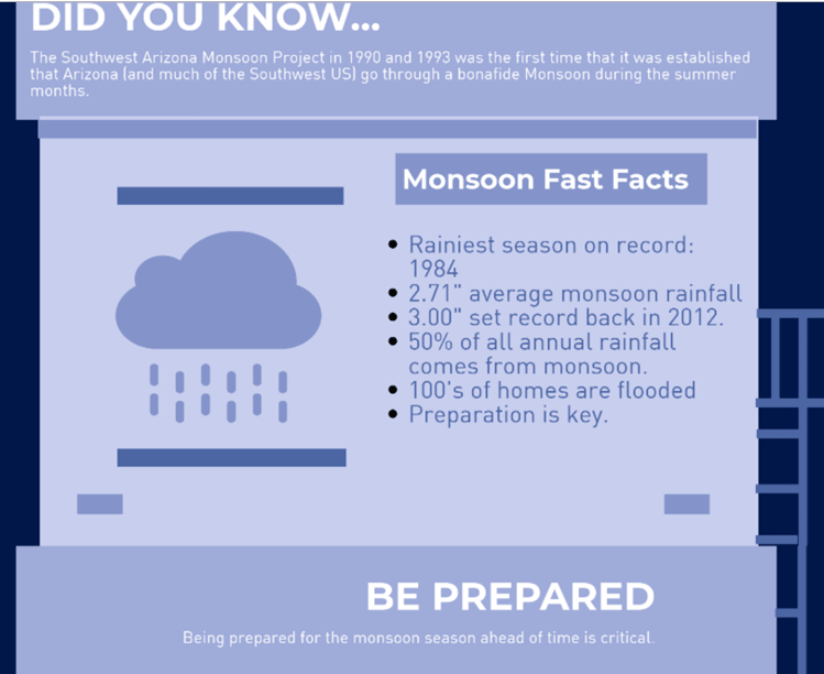
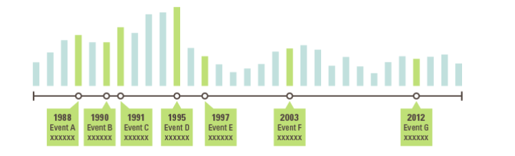
Infographic Bee provides an excellent example of using visual communication, specifically an infographic, to communicate complex information. In this case, it is weather patterns.
Canva

Canva has a blog that is dedicated to infographics that successfully represent complex information.
Conclusion
Visualzation methods such as infographics, charts, diagrams, timelines and other representations are effective ways of sharing complex information. These blogs exemplify how our society is depended on visual communication in order to understand the world around us.
