Data visualization is the key to audience understanding
As humans, we communicate through visuals. Data visualization utilizes visual communication to represent complex concepts. This is done to increase audience understanding. We do this by using charts, graphs, timelines and maps. Data visualization is used frequently in our society and is constantly developing as we develop. Tableau, Data Visualization Blog and Ownviusal showcase these ideas.
Tableau
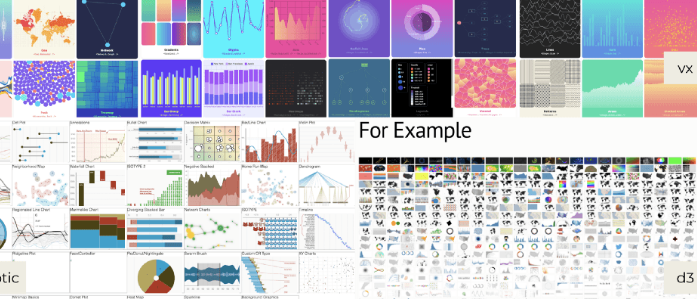
Tableau discusses the waves of data visualization and how it has helped our understanding of information as a society.
Data Visualization Blog

The future of data visualization follows innovations in technology. This blog discusses the possible use of virtual reality for multidimensional data.
OwnVisual
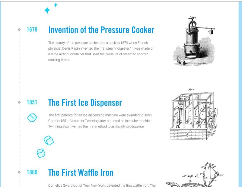
This is an example of data visualization in the form of a timeline. The purpose of the timeline is to visually communicate the evolution of kitchen appliances
Conclusion
Data visualization is constantly developing and has been used to visually communicate complex ideas. These three blogs show what data visualization is, what it might become and data visualization as an effective way of communicating ideas. Visualizing data simplifies information and makes it fast and easy-to-follow in our current fast-paced society.
