Infographics that are visual-heavy can overpower the content they are trying to present
We are a visual-based world. There is no doubt that visual content contributes heavily to our understanding of information. Infographics showcase this idea, although recently most infographics have been heavily focused on visuals rather than the actual content. Visual content is important, but it’s easy to overpower the information you are trying to present. InfogrpahicKing, Best-Infographics and Vennagae showcase some infographics that have this issue.
Infographic King
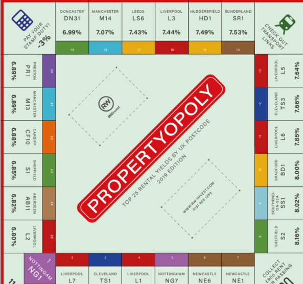
This infographic is clever in the idea of the monopoly broad to showcase the top 25 rental yields in the Uk, but visually its confusing to follow.
Best-Infographics
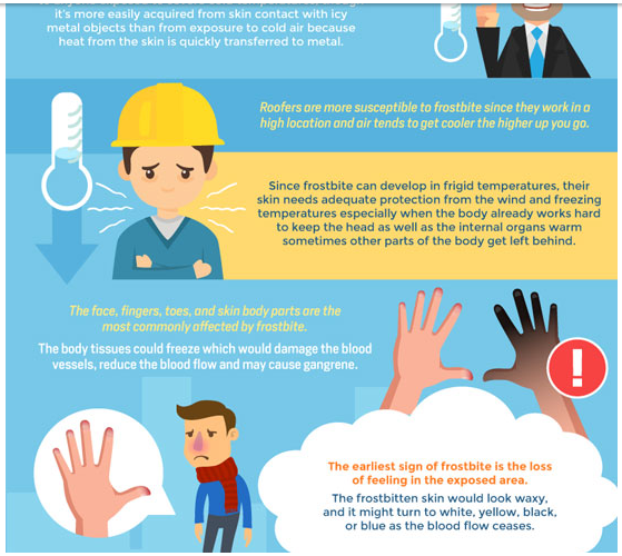
This infographic over-uses visuals to represent simple ideas. Because of this, the information seems harder to follow.
Venngage

This infographic is almost pure visuals and the mixed colour palette makes the content hard to follow. Here, the content is very hard to follow and hard on the eyes.
Conclusion
Visual communication is important to our every-day lives. These infographics represent the over-use of visual content in an effort to make the information easier to understand. In most cases, the information ends up being harder to understand because the infographics are visually hard to follow.
